The Art of
Architectural
Photo
Editing
Picture this: Beautiful light washes across a stunning building that buzzes with meaningful activity. The immediate environment is clean, tidy, and full of commuters, happy cyclists and families pushing prams into a sunset. The perfect architectural photograph would look something like that.
Twice a year the stars align, and images really look perfect straight out of the camera. But for most parts, architectural photographers have to deal with challenges that defy careful preparation. Sunsets fizzle out, pedestrian traffic ceases before the light is right, and there is always someone parking a red Honda in the middle of the hero shot. A jungle of road signage, utility boxes and roofs covered in bird poo further add to the chaos.
When I edit images, I aim for a healthy middle ground between lively clutter and sterile perfection. The sum of many small changes allows me to create emotionally impactful images that stay true to the nature of the architecture. Below, you can find a few examples of how I approach common editing challenges.
Restoring Natural Calmness
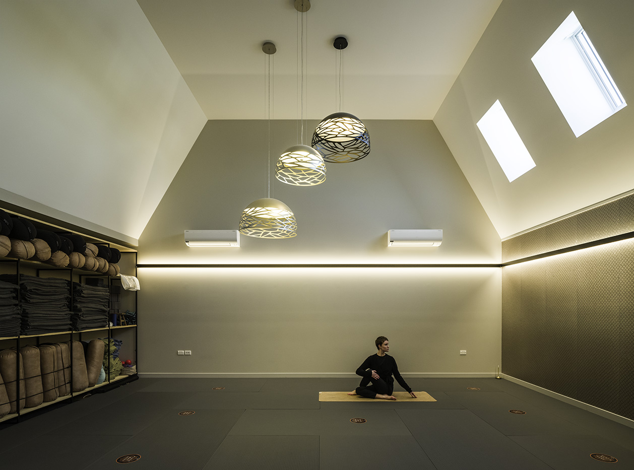
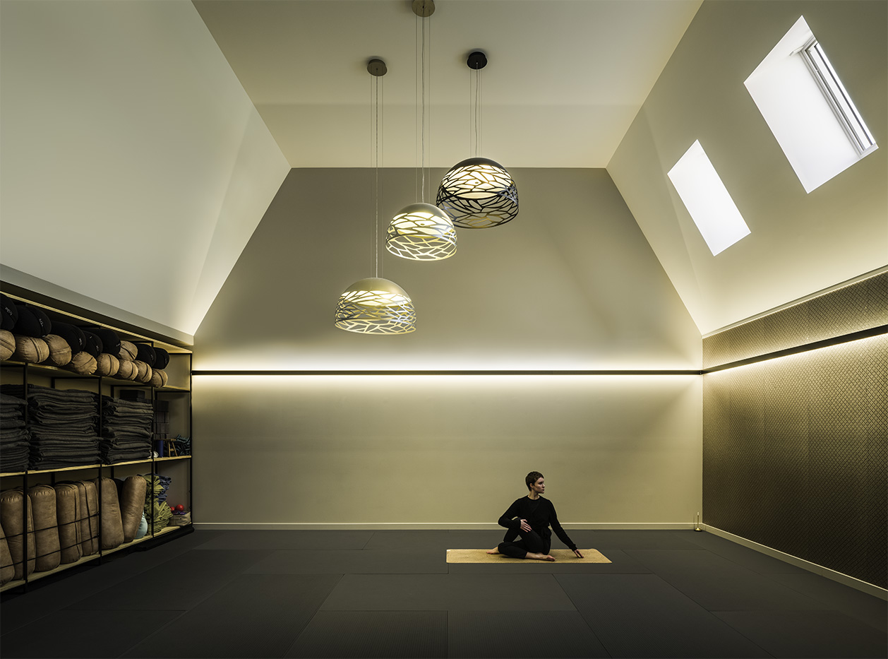
The brain does a fantastic job smooting out the hard realities of light and distractions. In an architectural image, I re-create the the experience of being in a space by removing distractions normally filtered out by the viewer.
A plethora of light sources was throwing complex shadows around the space. Removing distractions and ungainly shadows (left ceiling, AC), while restoring desired shadows requires a careful touch.
Busy Environments
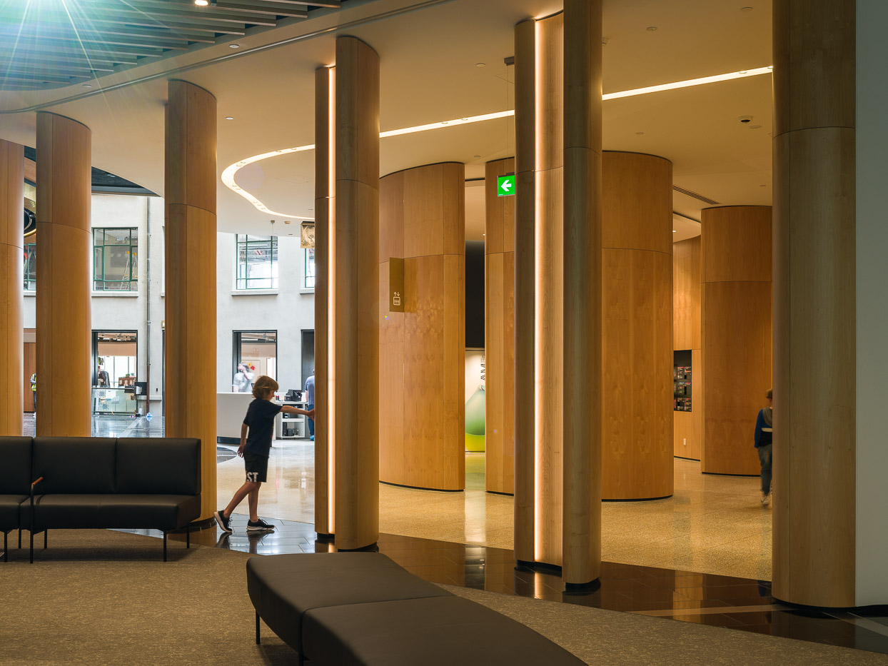
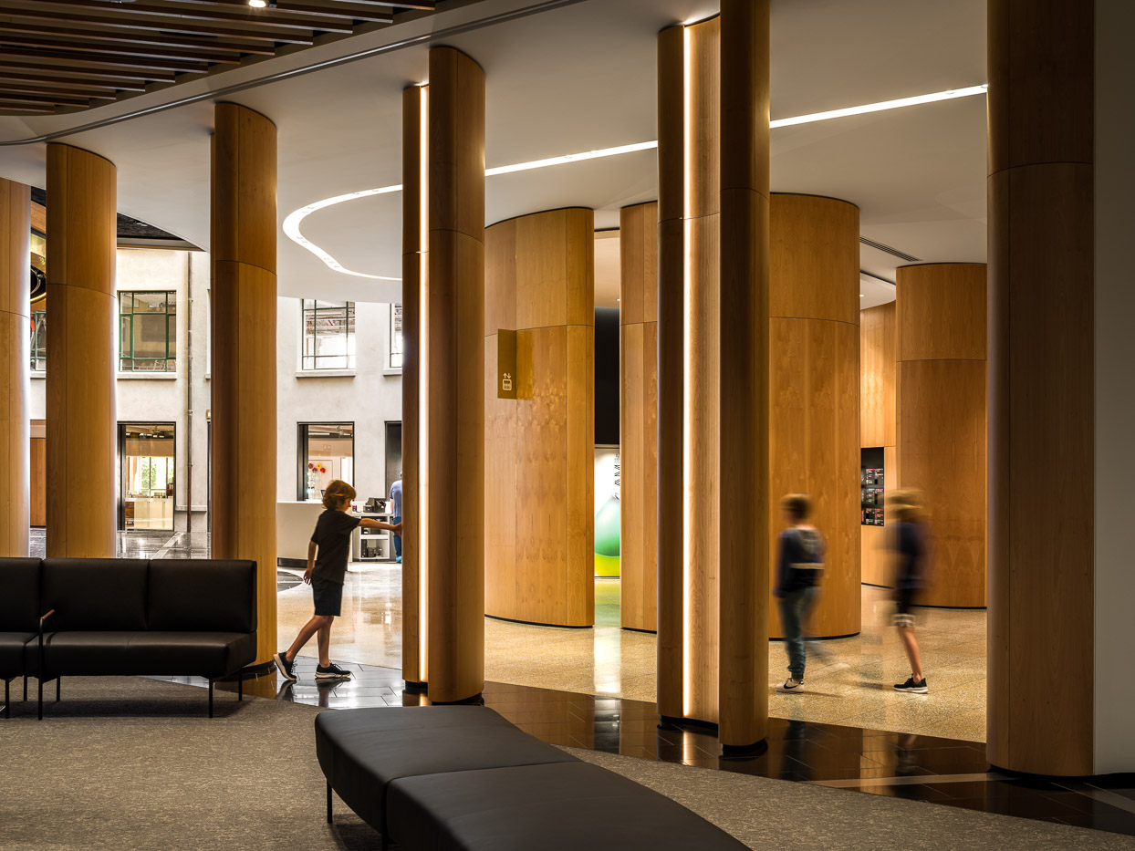
When the tradies are still finishing up in the background and your models are a little unruly, composites are the path to a clean image.
People from multiple images were merged together into one image that shows the flow of the space. Photoshop took care of ongoing construction work in the background, as well as the sensor clutter on the ceilings.
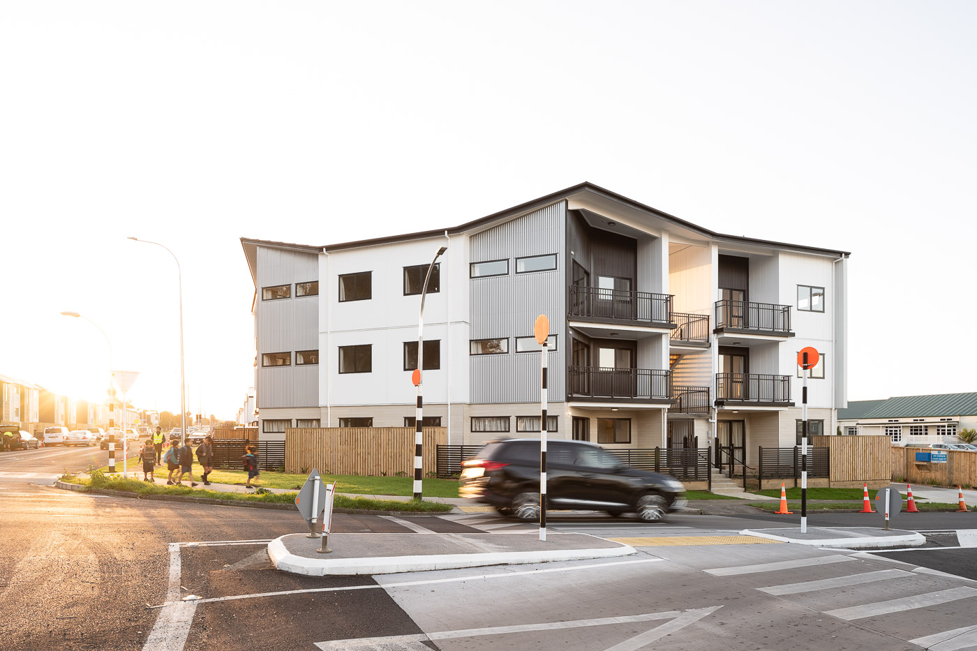

The Kitchen Sink Approach
When public spaces around a building are cluttered, I need to use a range of techniques for a distraction-free image. In this case I removed the car with an overlaid empty image while at the same time keeping the kids.
Traffic cones, lights and street crossing signage was removed with cloning techniques. As a final touch I added in clouds into the otherwise featureless sky.
Mood Enhancer
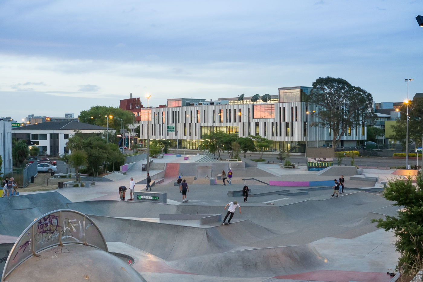
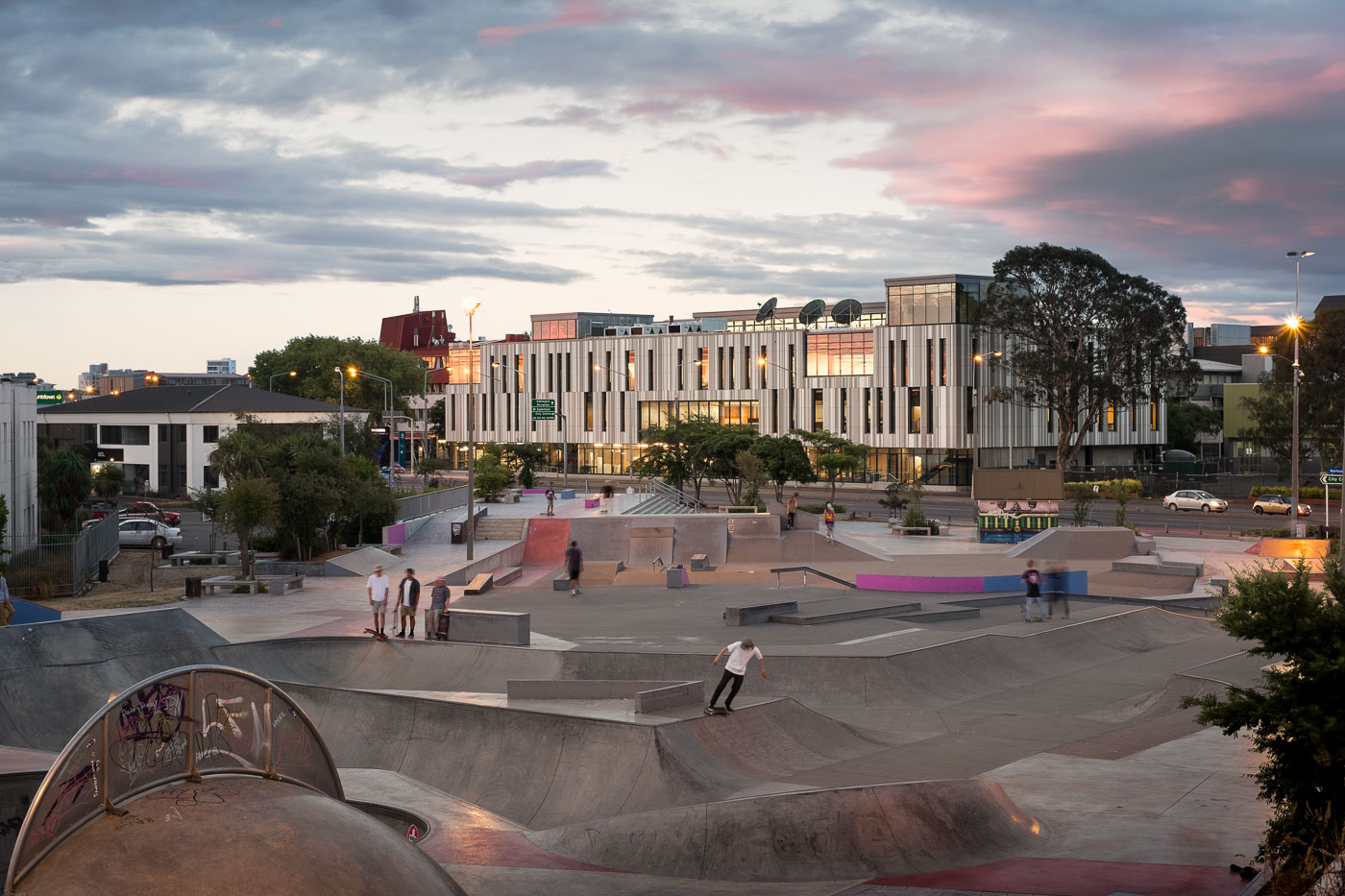
Sometimes, an otherwise perfect production day finishes in a disappointing sunset. This image received a replacement sky with a matching colour treatment to give this project the hero image it deserves. The changes result in a warmer image that draws attention into the frame.
Skaters and cars were combined from multiple images to emphasize the urban surroundings this teaching space is embedded in, while at the same time not overwhelming the main subject.
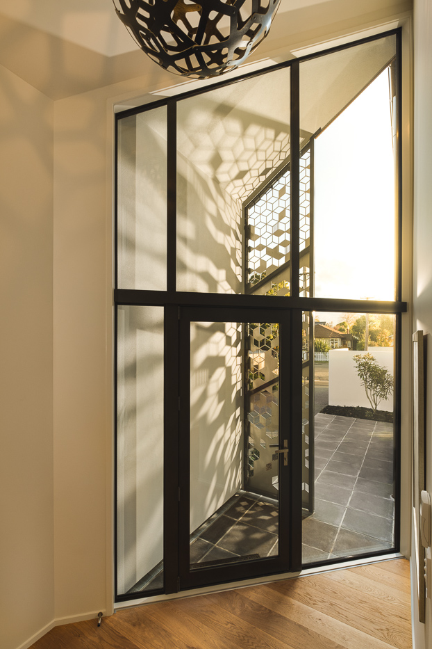
Homemade Sunset
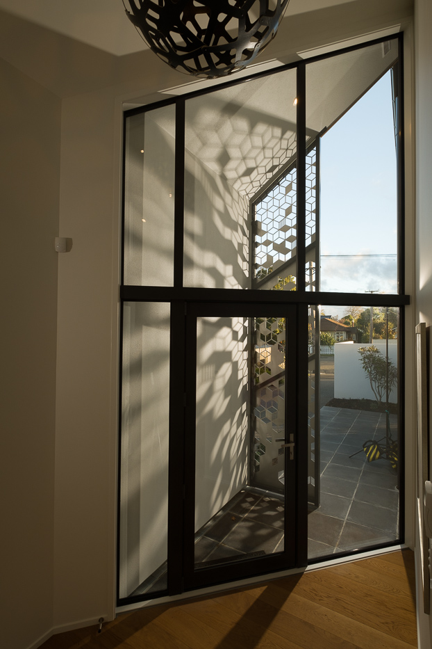
During our first project meeting the designer of this space showed me one rendering that embodied his vision for this space: A summer sunset casting shadows through a custom-engineering shading screen.
The only problem was that the sun never reaches the screen when we shot in winter. So we made our own summer sun.
Subtle Guidance
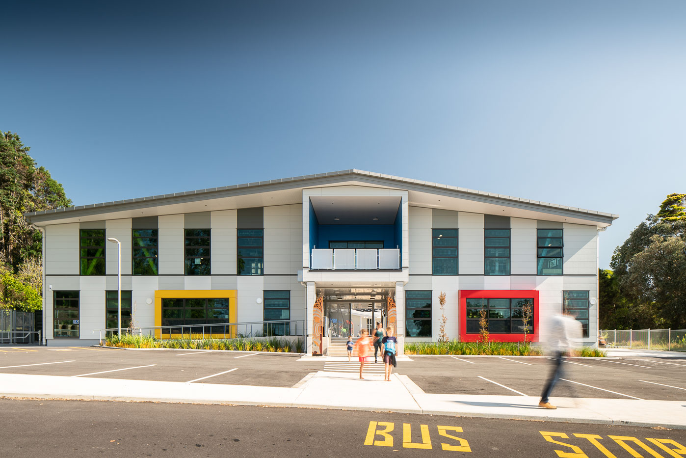
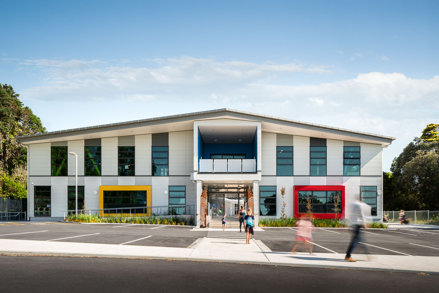
Its location in a valley required me to capture this school in harsh afternoon sunlight. A polarisation filter helped reduce unwanted reflection while enhancing detail and colour throughout the image. Using a polarising filter came at the expense of an unnatural sky that I replaced in post-production.
One of the kids was moved to allow a clear line of sight towards the entrance of the building, and to add emotional impact. Distracting writing at the edge of the frame was removed to focus the viewer on building and people. Colour adjustments helped to further refine this edit.
Overall, a dozen little changes allowed me to subtly shift the focus on the architecture.
Invisible Tripod
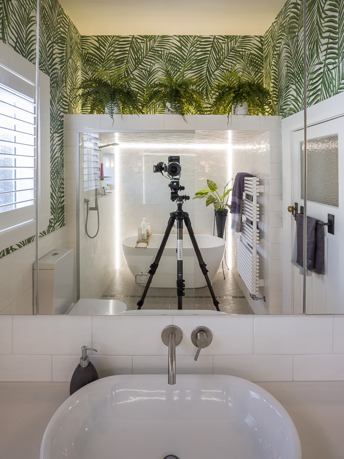
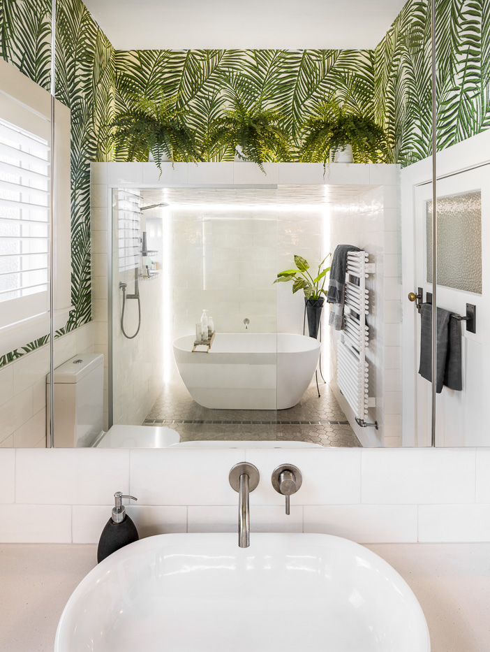
Some environments present challenges that are impossible to overcome without sophisticated retouching. Severely limited in compositions by a small bathroom, shooting into the mirror presented the only option to capture the space in its entirety. The tripod was later removed in post-production.
Everyday Hurdles
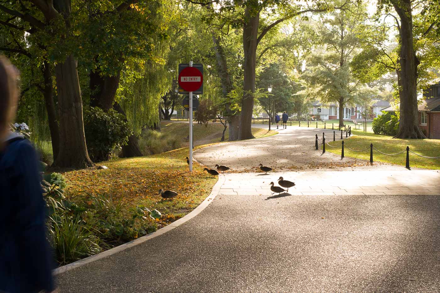
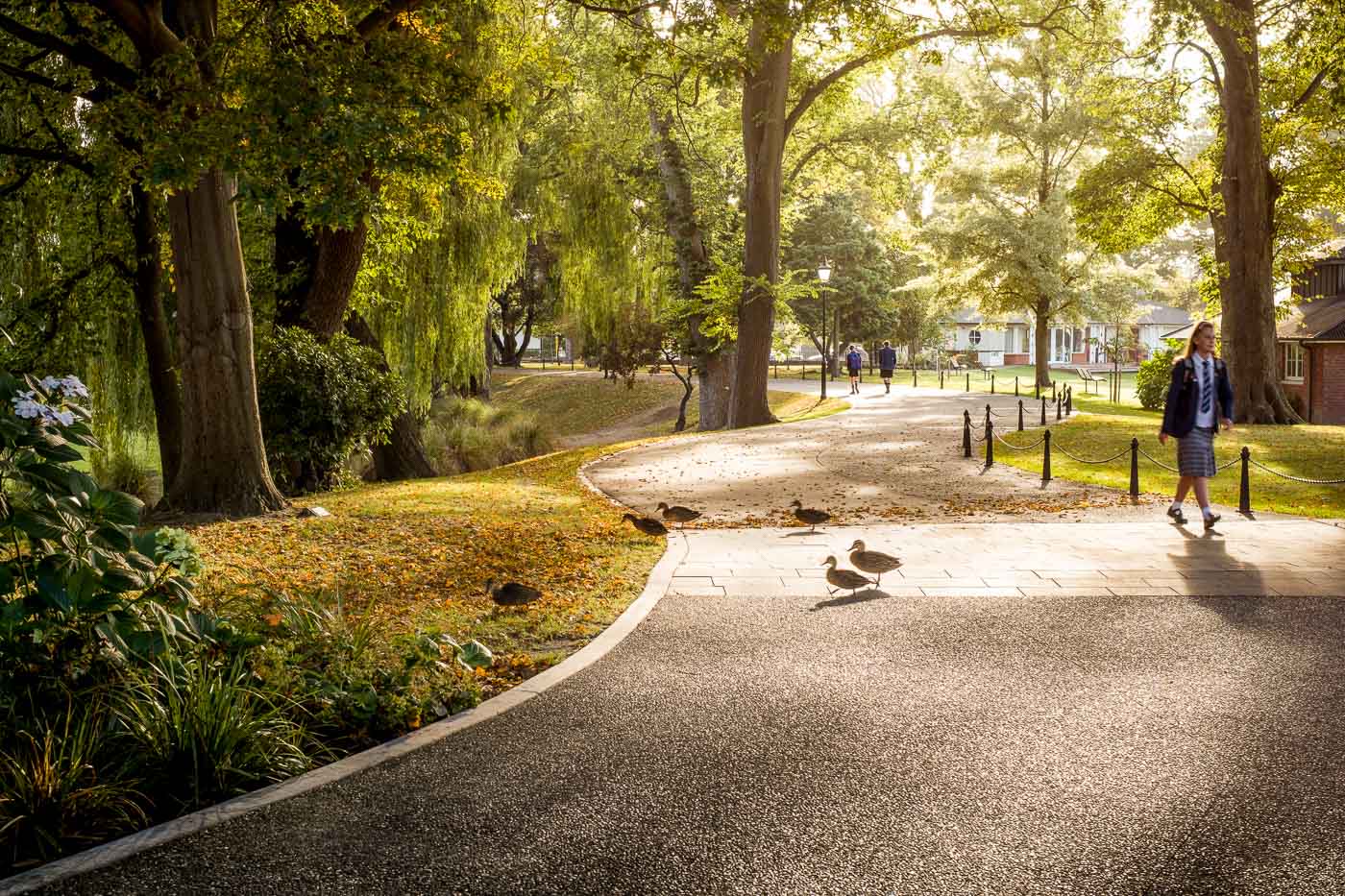
This project was captured with support of an amazing team of students volunteering their time. While humans are easily coordinated, a group of ducks was on its own schedule and had to be merged into supplemental images featuring the students.
My client considered the one-way signage to be highly distracting. Removing it allowed me to shift attention back to the natural flow of the path through the image.
Complex Composites
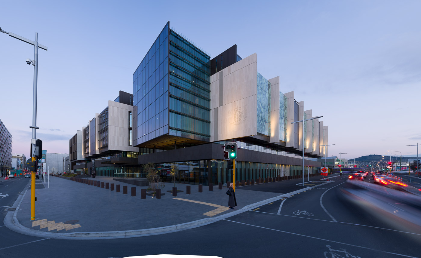
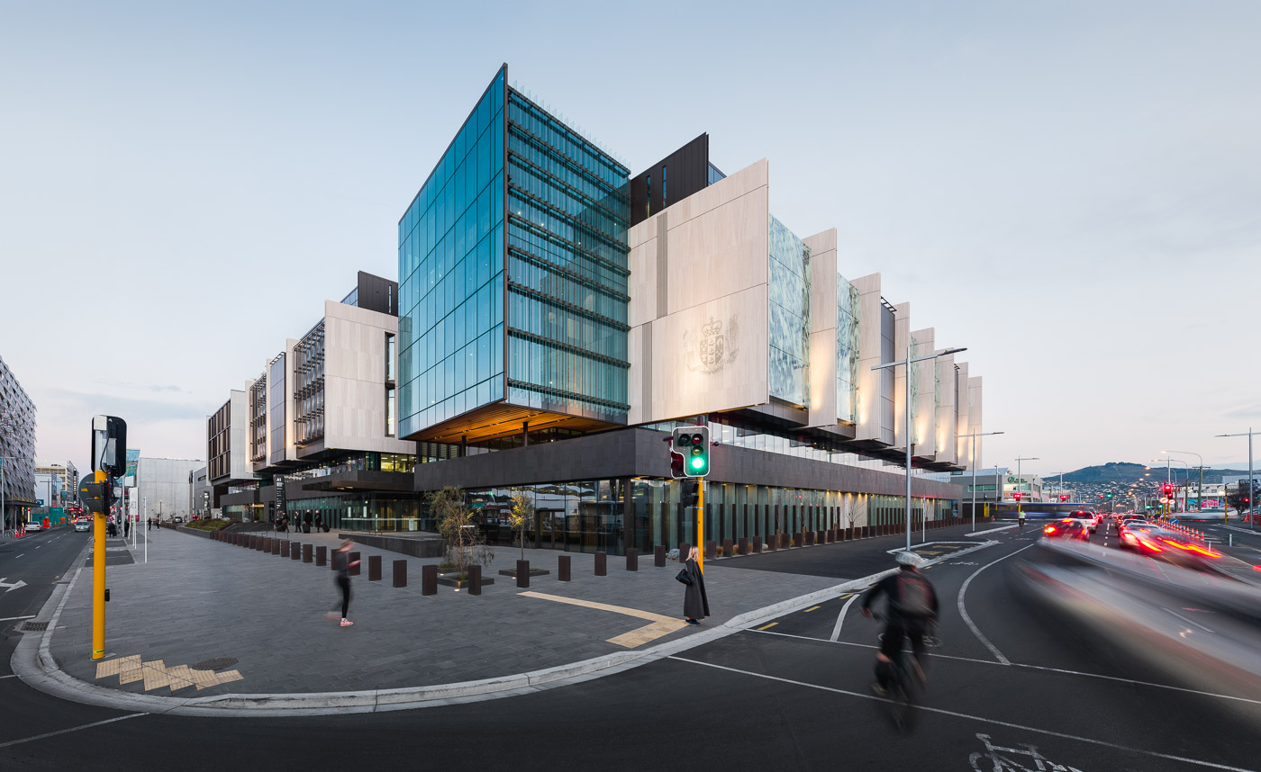
This hero image was high on my client’s wish list, but had to be captured long after the main project due to ongoing roadworks. To further complicate things, this image is an enormous panorama in the 100+ Megapixel range, which allows for giant prints.
Foot traffic late in the evening was slow by the time light conditions were ideal. People, traffic and cyclist were merged together from multiple images to reflect busier conditions earlier in the day. I decided to remove parts of a street light to avoid unpleasant tangents at the edge. The shot was finished with a colour treatment matching the look of pre-existing images, rather than staying true to actual conditions.
Minor Tweaks
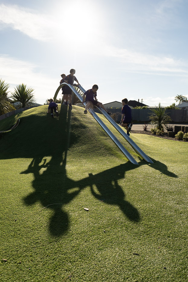
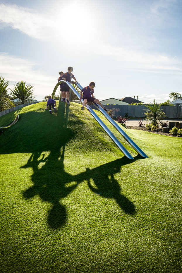
Kids on playgrounds, that is pure joy and explosive energy. Giving detailed instructions is somewhat futile and would only result in awkwardly stilted photos. Instead, you let the kids go to town, and sort the details in post-production. In this case, a near-perfect composition just required the removal of one of the kids by superimposing it with an empty frame.
Glare-Free Sunsets
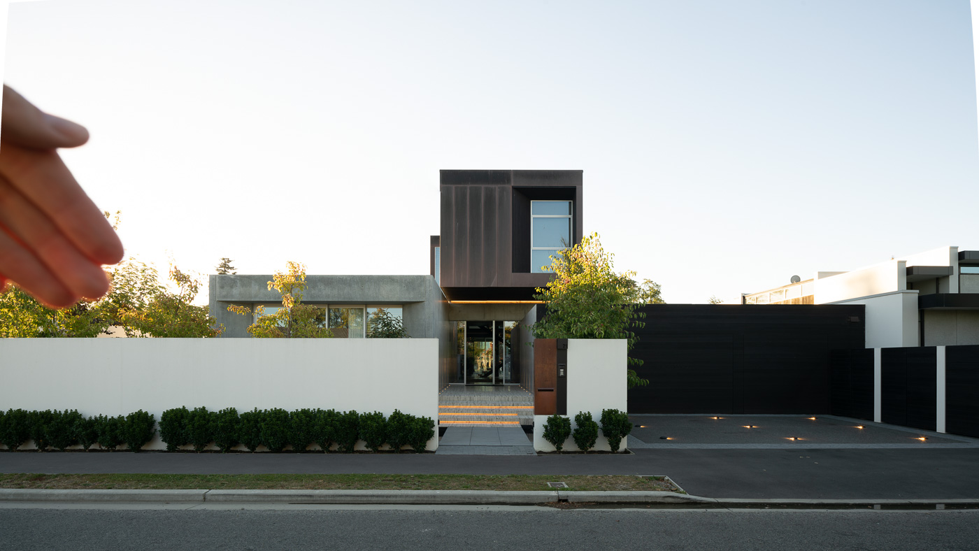
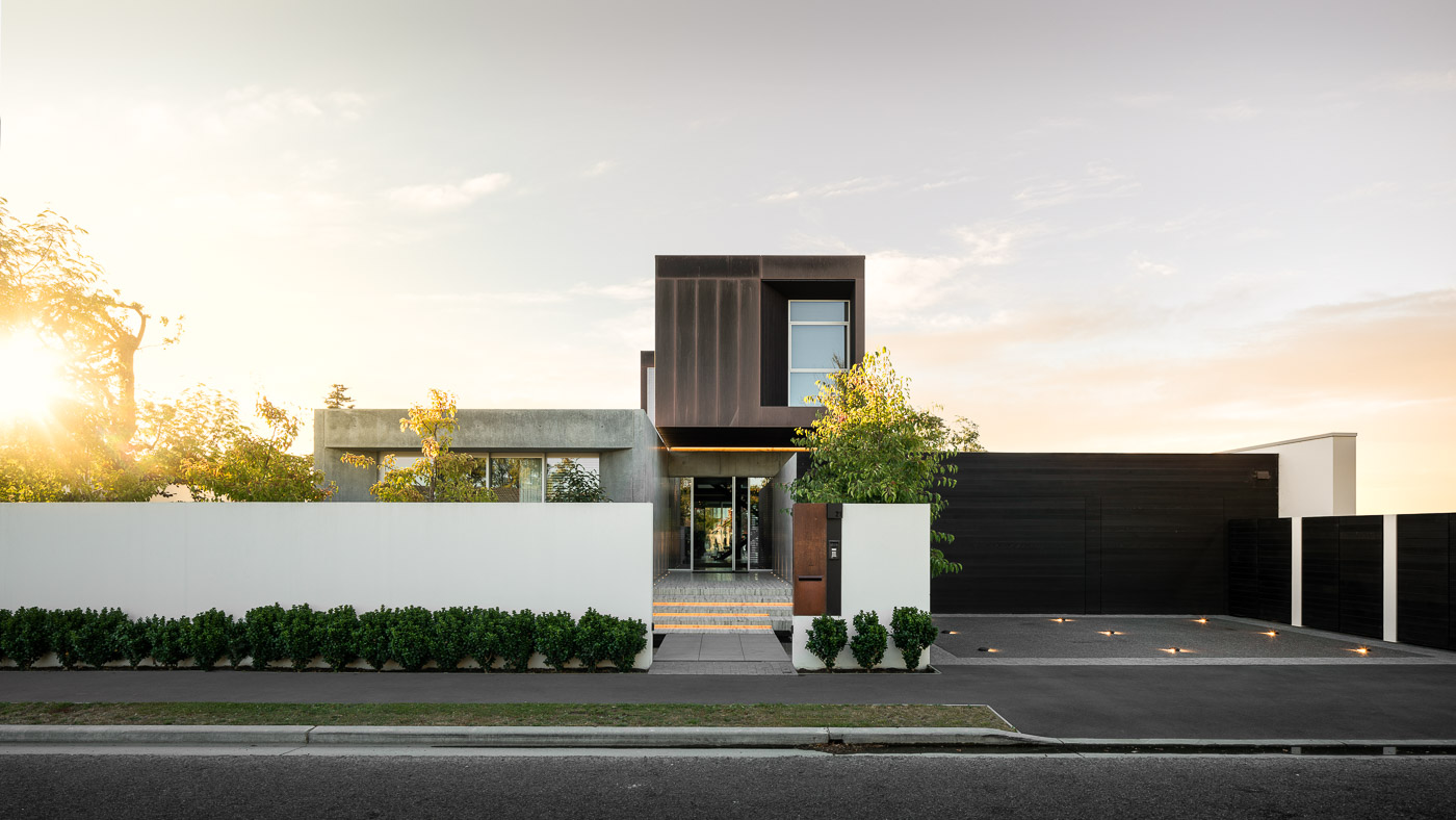
A golden sunset improves this image, but it came with its own set of complications: Shooting directly in to the sun introduces unwanted reflection that reduces image quality.
The final image was merged from exposures that had the sun covered and uncovered. A dull sky was replaced with a more interesting one that fit the overall mood, gaps in the landscaping were filled, and the neighbouring building removed to draw attention back to the centre of the the frame.
Colour Restoration
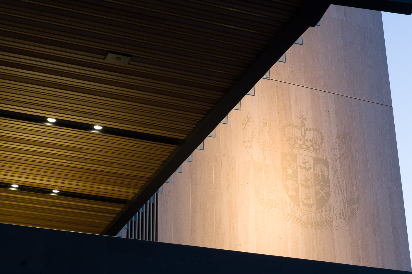
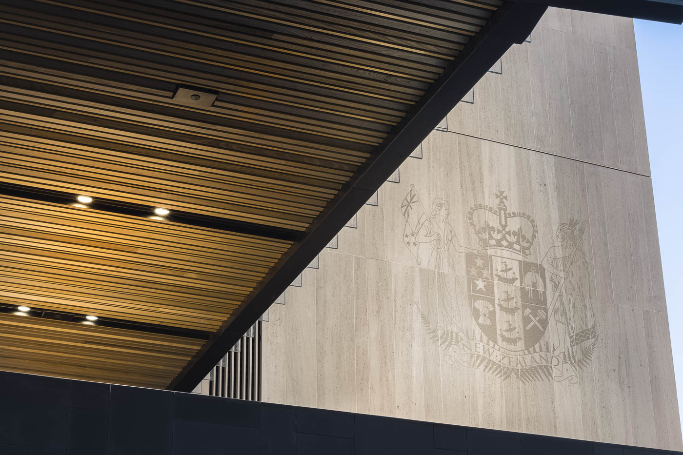
Simple images often present the greatest editing challenges. Taken just after sunset, this detail shot has differently coloured light sources competing with each other. In addition, an intense spotlight overpowers detail in an important stone etching.
The final image addresses these issues in a natural fashion while restoring detail in previously flat areas.
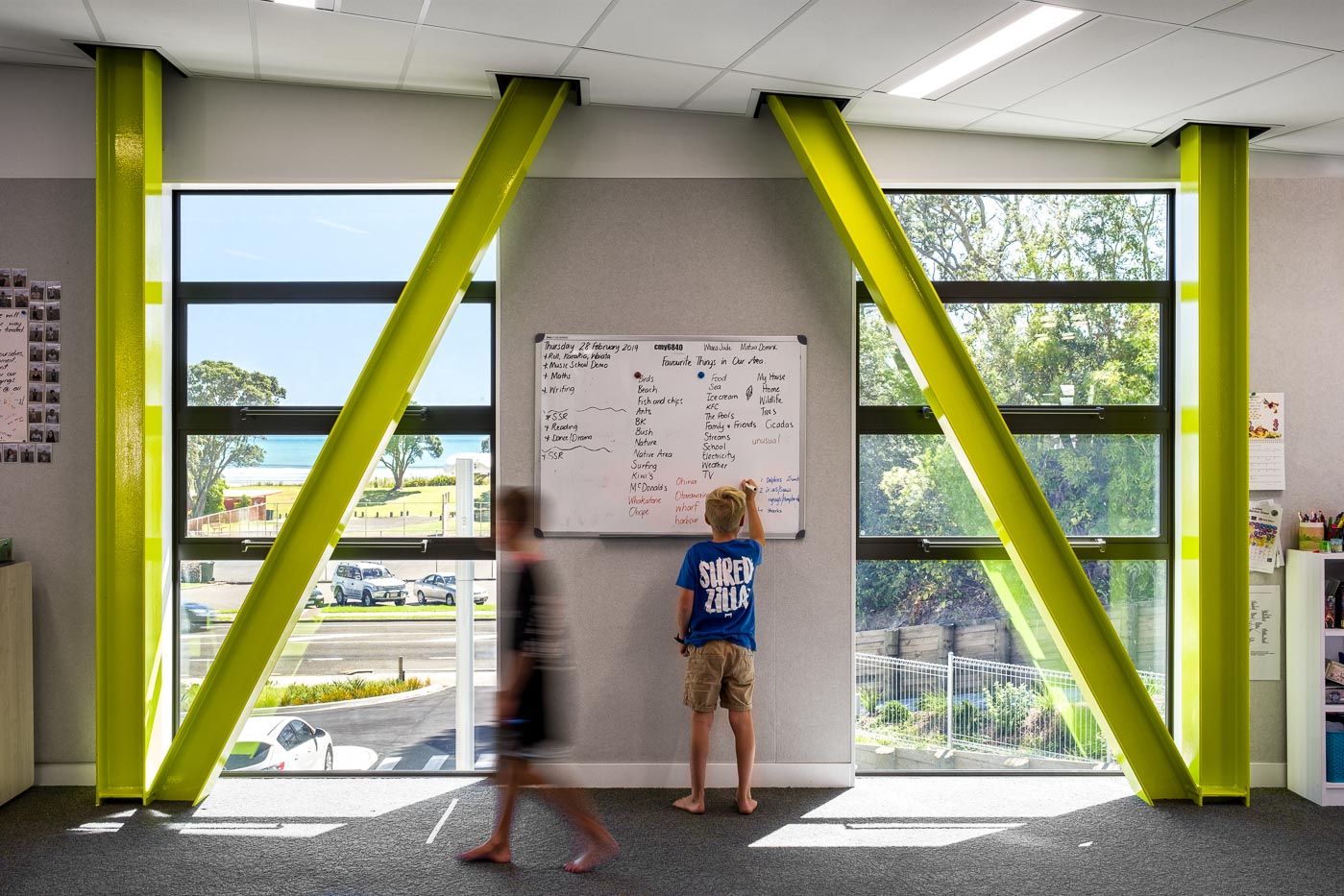
Bright Exteriors
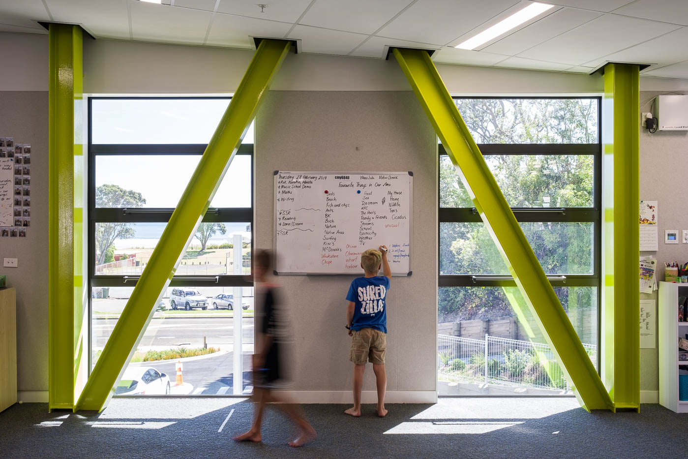
Schools are hives of activity, and I do my best to keep interruptions to classes to a minimum. Without the ability to use studio lighting, I merged a darker exposure into the base image to show the outside. Removing some of the clutter on the walls draws attention back to the architecture, while removing the blue hue of ambient light on the carpet subtly warms the image.
I decided to retain some of the washed-out light quality on the outside to avoid the famous ‘wallpaper-on window’ look so often seen in over-edited real estate photography.
